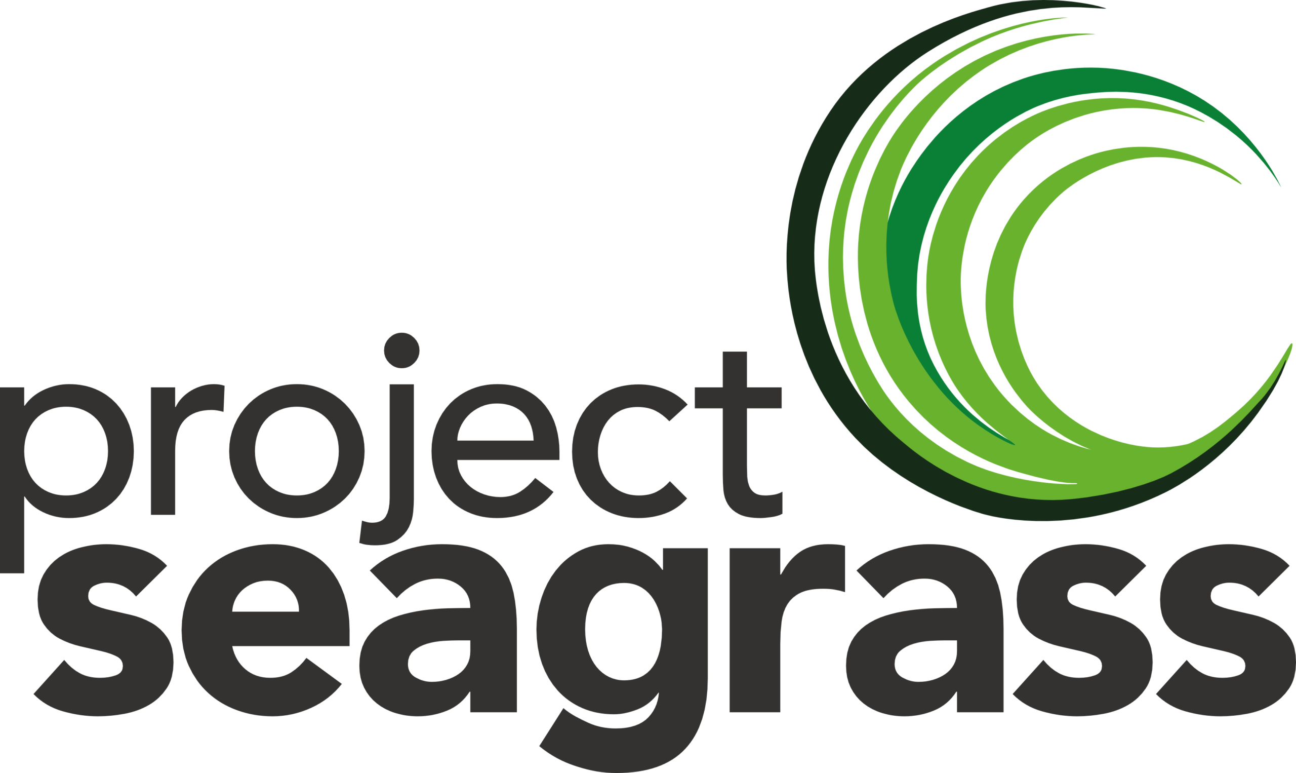
Embracing change: Introducing our refreshed Project Seagrass logo
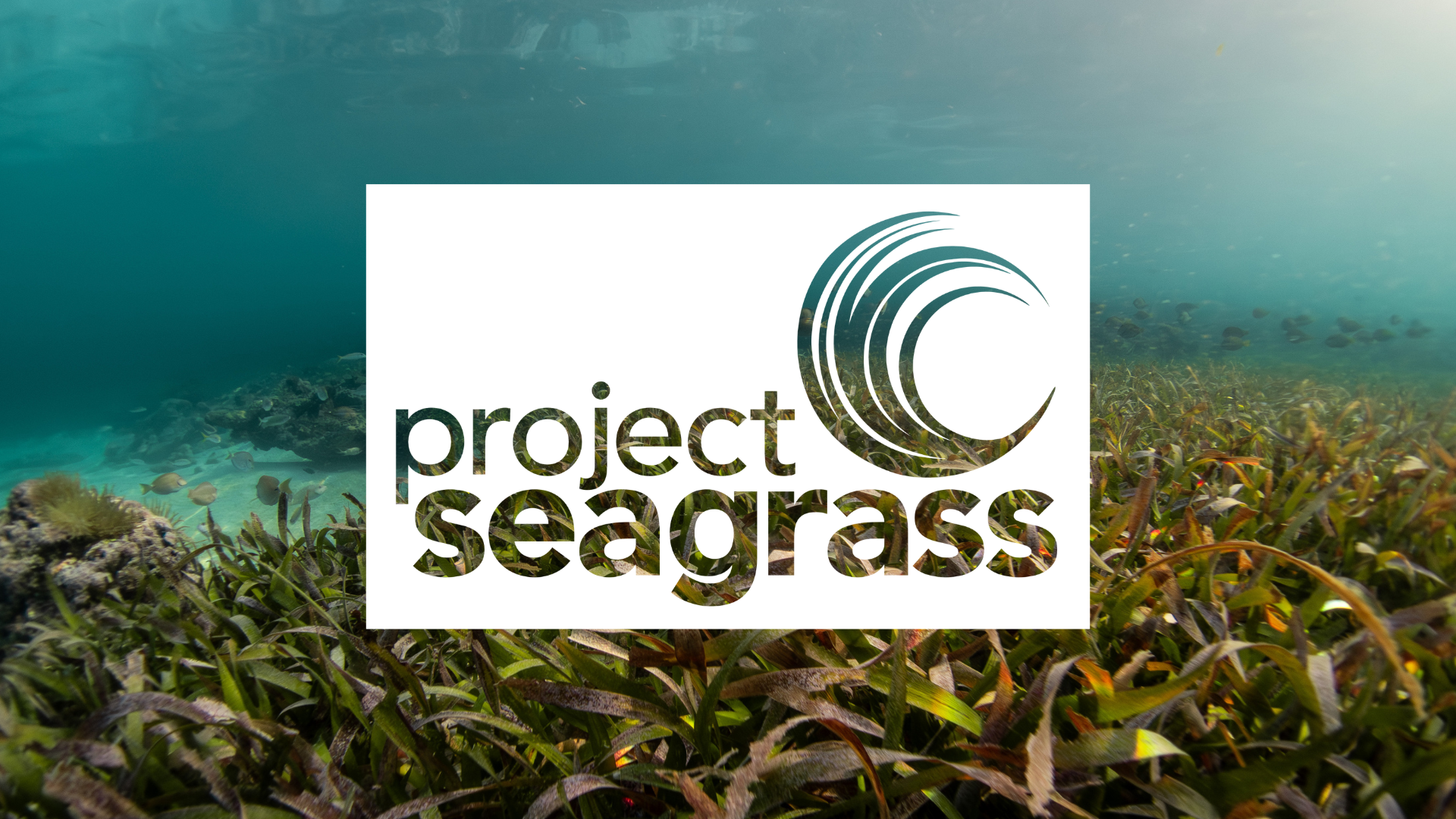
In this blog, our Chief Conservation Officer, Dr Benjamin Jones, shares the thinking behind the decision to refresh the Project Seagrass logo and wider brand identity, and explains why visibility matters so much for seagrass conservation. Honouring our roots, looking to the future Back in 2013, we founded Project Seagrass because we wanted to secure a future for seagrass. Since then, we have grown from a small research-led initiative into the world’s leading seagrass conservation organisation, working with communities, governments, researchers, and partners across the globe. Over the past 13 years, our logo has been part of that journey. It has represented our science, our partnerships, our campaigns, our conservation and restoration work, and our commitment to bringing seagrass into public and political view. It appeared on the first stickers and leaflets we produced for work in Wakatobi National Park, Indonesia. More recently, it has appeared in places we could never have imagined when Project Seagrass first began, including at the start of every concert in our patrons Coldplay’s Music of the Spheres World Tour. I’m often asked what inspired the emblem we use. The original emblem was inspired by the below image, that movement of seagrass beneath the waves. For me, this image became a symbol of what Project Seagrass was created to do; build a movement powerful enough to create a wave of change for seagrass meadows around the world. A Zostera marina meadow off of Fishers Island, NY, USA. Credit CCE Suffolk County Marine Program. Our refreshed logo is not a dramatic departure from that history, but an evolution. The circular wave of change for seagrass remains central to our identity, reflecting the change we want to see for seagrass meadows globally. This maintains a clear link with the logo that has represented Project Seagrass over the past decade. But the refreshed design gives us a cleaner, more confident, and more adaptable identity for the next stage of our work. Why now? Project Seagrass is now 13 years old, and our brand refresh comes at the mid-point of our 2022-2031 strategic plan. This is also a critical decade for the ocean. Around the world, governments, communities, and organisations are making decisions that will shape the future of marine and coastal ecosystems for generations and seagrass must be part of those decisions. One of the central aims of our strategic plan is for Project Seagrass to be a global champion for seagrass ecosystems. That means being trusted, recognised, and effective. It means continuing to lead through science, collaboration, community action, policy, and education. It also means communicating in a way that is clear, accessible, and ambitious. The timing also reflects where Project Seagrass is heading. With our selection as a strategic partner of the King Charles III Charitable Fund, and the launch of our Global Seagrass Challenge Fund, we are entering an important new phase of our work. We need a visual identity that can support that ambition, helping us engage new audiences, work with new partners, and continue building the global wave of change that seagrass needs. Our refreshed logo is part of that ambition. It signals that Project Seagrass is growing, evolving and ready for the next stage of our work. It reflects our commitment to working globally while staying rooted in the values that have always guided us: science-led, collaborative, equitable, optimistic, and passionate. Why we refreshed our logo In late 2025, we ran a survey to better understand how people perceived our old logo and what it communicated about Project Seagrass. The results showed that our old logo was clearly associated with the environment. Many respondents felt that it looked professional, and easy to recognise. That told us something important. The foundations of our visual identity were strong. But the survey also highlighted where we needed to improve. The old logo did not stand out when compared with other environmental organisations. Only around a third of respondents agreed that it stood out in that wider landscape. For an organisation whose role is to champion one of the world’s most overlooked marine ecosystems, that’s obviously important. Seagrass remains hidden in public awareness, policy debates, and conservation priorities, relative to other habitats and species. If Project Seagrass is to continue raising the visibility of seagrass globally, our own identity needs to be clear, distinctive, and recognisable. The purpose of this refresh was therefore not to start again. It was to strengthen what was already there. Making Project Seagrass more distinctive The conservation sector is full of important organisations doing vital work. But it is also crowded and distinctiveness matters. A logo isn’t just an image on a website, social media profile, or report. It’s a tool that helps people recognise who is speaking, what we stand for, and why our work matters. For Project Seagrass, it also has to do something more specific. It has to help make an overlooked marine ecosystem visible. Our refreshed logo keeps continuity with our original identity while improving clarity, balance, and impact. It gives us a stronger visual presence across reports, policy briefings, social media, campaigns, and more. It also gives us a more flexible identity that can work alongside partners, funders and collaborators while still being recognisably Project Seagrass. Ultimately, to make seagrass visible, we also need to be visible ourselves. Designed in-house I designed the refreshed logo in-house, building on the original Project Seagrass logo that I created when the organisation was first established. This refresh was never about replacing our identity or moving away from our history. It was about taking something familiar and making it work harder for the organisation we have become. The refreshed logo carries forward the circular wave of change for seagrass that has represented Project Seagrass for more than a decade, while giving us a cleaner, more flexible, and more confident visual platform for the future. I’d also like to thank award-winning artist and author Janina Rossiter for her support with the development of ideas as part of this process, building upon our collaboration as part of the Coldplay Creative Competition. Her creative input helped us think more broadly about how seagrass can be represented visually, and how our